Introduction
When it comes to Quality Score you’ll find there are LOTS of opinions.


What you’ll find though is a distinct lack of cold hard data. You know, the kind of information you can rely upon because there is evidence that has been carefully analyzed.
So, our in-house math professor and I sat down to dig past the opinions and see what we could figure out by diving into actual data. We didn’t have a specific goal in mind other than to find answers that could better inform our future decision making and eliminate all the unhelpful opinions once and for all.
To do this we’ve first looked at the overall picture as it relates to Quality Score. Then, we’ve broken down each individual component of QS to determine what influences it. After all, the first question we needed to answer is “Should I even care about QS?” If the data suggests that it doesn’t matter, then why bother.
Our journey in evaluating QS starts with the Google Ads support documents – to see what they have to say on the subject. And then test their various statements (and their implications to see if the data we see supports them).
We’ve also reviewed a few articles and blog posts by industry experts, to see how their content is reflected (or not) in our data.
Then, we just followed the data. Every test we ran would inevitably lead to another, and another. In fact knowing when to stop in writing this report is actually one of the most difficult decisions we had to make. I honestly feel we could double the scope and still have unanswered questions, yet we’ve already run more and bigger tests than anyone else I know.
Finally, after doing this for all the elements of QS put together the findings into a series of steps that you can use to optimize your accounts. After all, you’re looking here for the answers, not the mathematical journey it took to find them.
Quality Score Mythology
You might recognise this chart:
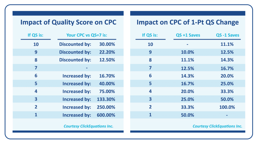 Figure 1. Older Tables Showing the Impacts of Quality Score on CPC
This graphic – or versions of it have been quoted, requoted, and quoted again. It’s part of the history of QS. It was featured on the Wordstream website, although as you can see from the attribution, it did not originate there (ClickEquations Inc was acquired several years ago so the original source link is gone). It’s still live on the Wordsteam website today.
Unfortunately, it dates back to March 2013. A lot has changed since 2013, and yet you’ll still see marketing agencies quote it today. Look at this chart here from TenScores – it’s a little prettier but it’s the same chart:
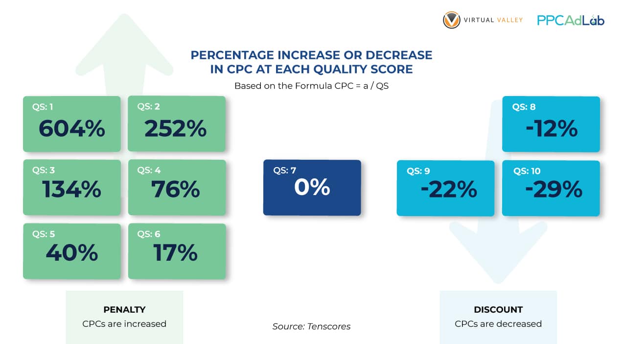
We had two concerns with these charts.
First – they are super old.
Secondly, as you’ll see shortly – they ignore the “Null” quality score – and that’s a big deal. Null technically isn’t a score, it’s the absence of a score. It’s Google saying, we don’t yet have sufficient data to give this keyword a Quality Score. In this analysis, we’ve done a lot of work on “null” – it’s important.
It’s exactly these types of charts that we want to better understand in producing this report. We’re not saying they are bad. Equally, we’re not saying they are good. Just that until we have our own analysis that we can rely upon and that is up to date in 2021 then it’s impossible to be confident.
It’s worth noting that both authors of these charts have skin in the game in terms of software or services to sell. The only thing we’re selling here – is our blood, sweat and tears in producing this analysis. We care about reaching an outcome. We don’t care what it is!
So let’s move on to the actual testing.
Our test dataset
Clearly, any conclusion presented here is dependent upon the reliability of our dataset. So let’s dive into that a little. Let’s set the scene so to speak.
In looking at Quality Score, we examined:
- $8,518,213 in ad spend
- 398,921 search terms
- 396,673 clicks
- 192,603 keywords
- 19,858 ads
- 7,821 landing pages
- 2,685 campaigns
- 725 accounts
- 5 countries
- And a partridge in a pear tree *
Whether you consider that data set big or small, doesn’t really matter. What matters is that we validated each conclusion using p-value calculations with a 95% confidence level or higher – in most cases – much higher. So, without diving into the math, you can be confident that there is no opinion, basis or preconception in our findings. Just statistically validated data, and our analysis of it.
How we selected data
To filter our dataset, throughout our testing we only included data rows where clicks were > 0 so we haven’t done any work on keywords or ads etc where there were no clicks. To be 100% honest and transparent it was a hack to keep the data small enough to process. Try running calculations on nearly 400,000 rows of data and see how your laptop likes it (you might want to go make a drink, or in the worst case watch a movie).
So, with the data we have we can rely on our results. Another data set might change the results, and in which case we’ll update our conclusions but for now, we have what we have.
In addition, where necessary, we have taken our hypothesis and run real-world tests to verify the impact of an action in moving quality score. Where this is the case we’ll disclose it.
It’s worth a mention also, that in this report we treat the null QS – shown in Google Ads as “–” as a 0 QS. We recognize that’s not technically correct – it is null (ie no Quality Score) rather than a QS of zero, but try doing calculations on “–” and let me know how you get on. It’s a slight simplification that makes math possible.
Our Tests
To produce this report we’ve run lots of tests. Not all of them are included (the final document is already much bigger than intended at the outset). But to give you an indication of the number of tests run, it’s over 70 individual tests. Many of them didn’t prove to be particularly informative, so they are left out.
In some cases, we’ve left in results that while not interesting in terms of their individual outcome, show us part of the journey to a discovery. Enjoy.
The Big Picture
Overall Quality Score Distribution
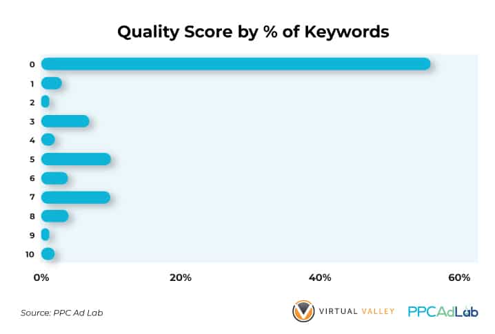
As you can see, by far the most common score is 0 – i.e., unscored.
So, for over half of search terms (56%) there is no way for the Account Manager to evaluate QS impact on their keyword. Thanks Google – super helpful.
What’s more, only 2% of keywords get the highest score of 10, and only 9% in total score 8 or above.
Therefore, 91% of keywords have a BIG opportunity to improve. But is it worth the effort and and if so, how, do they improve. We’ll come to that later.
Before we move off the big picture though let’s look at this a couple of different ways.
Let’s take a look at QS by spend and clicks.
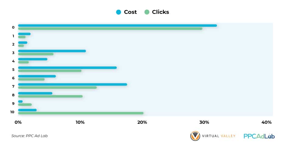
What we see here is a hugely different pattern.
Looking at cost, we see a pattern very similar to the number of keywords, albeit less pronounced.
We see 32% of spend having a zero QS (compared to 56% of keywords) and only 9.6% of keywords having an 8 or higher QS (compared to 7.8% of keywords).
The middle is a similar squash of spend, languishing in the 3-7 range.
But when we look at clicks, something interesting happens.
First of all, less than 30% of clicks (29.8% to be exact) are on keywords with a zero quality score. We’ll dive into this point later).
And while the middle 3-7 QS’s are very similar to the number of keywords, 8+ is where the magic happens.
| A whopping 33.3% of clicks go to keywords with a QS of 8 or more |
Hmm – it seems that there is something worth following up here. More to come.
Does it matter?
So we now know how QS is distributed. But should we care, what impact does it have on our campaigns – and are the legendary charts true.
For QS to matter, then there are two things we should consider.
- Does it affect my Cost per click (CPC)?
- Does it impact the ability of my ads to get shown?
If the visibility or cost of our campaigns isn’t affected then why care?
Impact on CPC
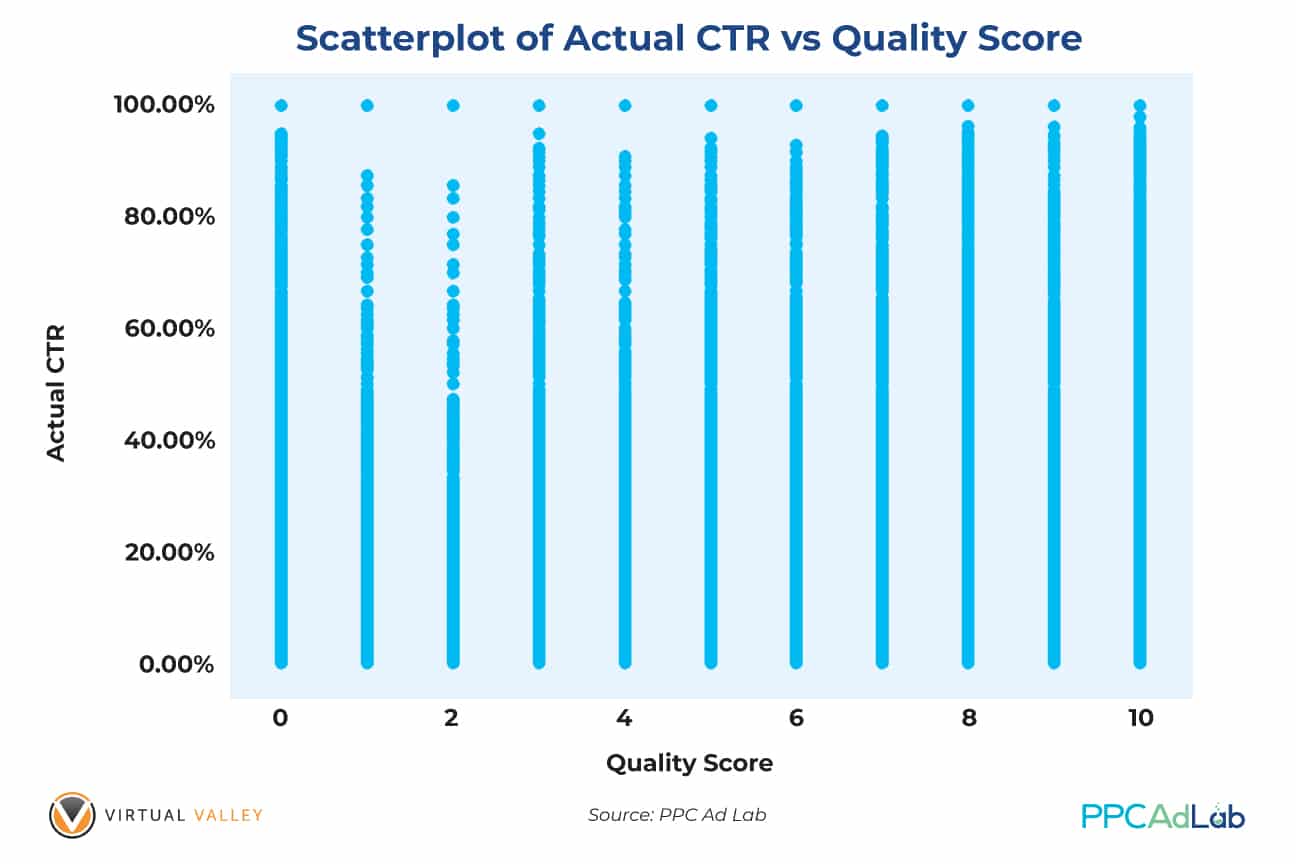
To start, here’s a simple chart of average CPC against QS. This is across our whole dataset.
Population Data Dataset
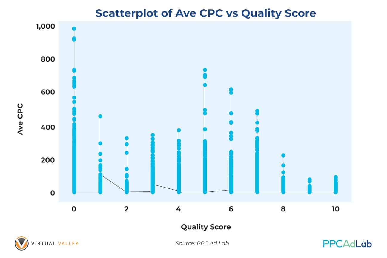
In order to read this graph, consider that each point is plotted individually and when lots of points are plotted close to one another, you get a line. So, the denser the population, the more solid the line appears.
You can see an overall downward trend in average CPC’s at each point in QS, with something of an anomaly around 5-7. We’ll look at that shortly.
In seeing this “anomaly” and by that I mean, “it’s not what the mythology tells us”, we dug a little deeper, excluding very large accounts that had the potential to distort the conclusion.
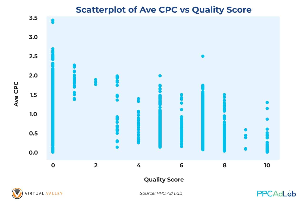
Again, looking at this chart which excludes the large accounts, our scatterplot shows that for each Quality Score, the average CPC’s change in a cyclic manner – i.e., there is no change from what we found previously. The pattern goes down, goes up and then down again as QS increases.
Again, as this pattern conflicts with the mythology we’ve dug deeper into individual accounts. We’re not showing these tests here as each is statistically insignificant but again, we’ve seen exactly the same pattern.
Let’s look at it a slightly different way.
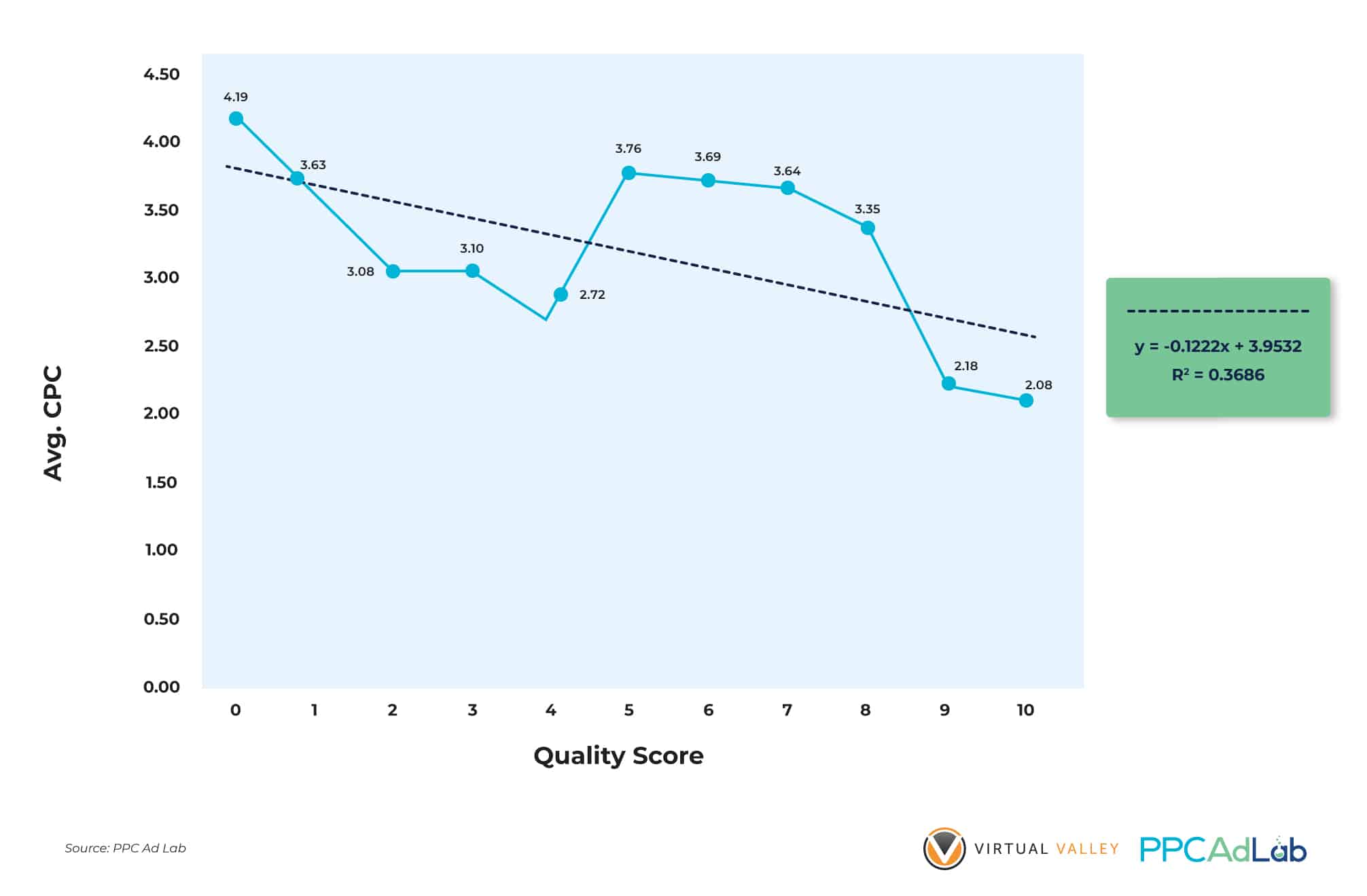
Based on the charts above, our finding reveals that average CPC does not always go down if QS goes up. The only time you can find a perfectly linear relationship between QS and Avg CPC is when using dummy data. In reality, the average CPC of QS = 1 could be equal to or very close to an average CPC of ads and keywords with QS = 5, 6, 7 and probably 8.
Translated from math to English, we found the following to be true in our data:
|
At this stage we don’t have an explanation as to why this is the case – but we’re still digging (please feel free to add your test suggestions to see if we can validate them). We can also glean from the chart that Avg CPC explains (in this particular subset) 36.86% of the variations in QS (R2 = 0.3686) which implies that Average CPC can explain more than one third of your QS ratings.
Ad Visibility
Having no QS is, in terms of cost, the absolute worst position you can be in. A null QS is worse than 1 and substantially worse than 10.
Yet there is one area in which null is an advantage – getting your ads shown.
Take a look at this chart:
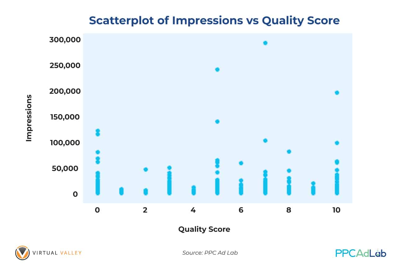
| As you can see, keywords with a null QS, show far more often than keywords in the 1-4 range. QS does not simply affect the price that you pay per click. It also influences the likelihood of your ad being shown at all (not ignoring budgets or bids). |
Put simply, want your ads to be seen by your idea prospects? Improve QS with the steps that we will demonstrate of the next sections of this report.
Impact of bids
Using other subsets, we’ve seen that higher Average CPC’s (essentially, bids) can make a huge impact on your QS so there is a need to bid high enough to help improve your QS.
What we do know though is that if you have a null score, you absolutely have to push to drive ANY POSITIVE QS. And if you are in the 5-7 range, push through to 8 and above. Price is part of the reason but there is more below.

In testing our theories, we used correlation analyses to determine if there exists any significant relationships between QS, Avg CPC and Cost. We tested our hypotheses at the .05 level of significance and p-values obtained were lower than .05 (significant).
Our results were expected and proved our points: QS has a significantly negative relationship with Avg CPC which implies that as QS increases, Avg CPC generally decreases (note the mid-score bump).
On the other hand, QS positively correlated (0.084) with Cost (expected). This means that as your QS improves, you’ll most likely get more impressions and clicks which will naturally equate to higher costs.
Summary
From this top-level analysis, we can conclude that:
|
What Google Says
You can find everything Google says about Quality Score here.
Let’s pick out a few highlights:
“Quality Score is intended to give you a general sense of the quality of your ads. The 1-10 Quality Score reported for each keyword in your account is an estimate of the quality of your ads and the landing pages triggered by them. Three factors determine your Quality Score:
- Expected clickthrough rate
- Ad relevance
- Landing page relevance”
Quality Score is based on past performance data, and Google reports that a null score – shown as “–” is when there are insufficient impressions or clicks to determine a Keyword Quality Score.
Null QS can also occur when you don’t have enough “Exact Match” impressions, i.e. when your ad is shown on searches that are an exact match of your keyword.
Also, a keyword with a QS can revert back to a null QS if it doesn’t have enough recent traffic to maintain QS.
Here’s Google’s example of a “high-quality” ad experience.
- When Sam searches Google for “men’s striped socks,” he sees your ad. (Your ad has “[striped socks]” as a keyword.)
- Sam clicks the ad and lands right on your website’s “striped men’s socks” page. The page loads quickly and is easy for Sam to use.
- Sam buys several pairs of striped socks
This example has a few key points implied in it:
- That Google will show your ad for the exact match keyword “striped socks” for the query “men’s striped socks” – now this is not an exact match
- That a fast loading web page is important
- That the user completing an action (i.e. a conversion) is important
Our Quality Score Equation
As we know, Quality Score is composed of three known variables: Landing Page Experience (LPE), Expected CTR (ECTR) and Ad Relevance (AR). We have made huge efforts to find the most appropriate equation to explain what your Quality Score will be based on the three variables above.
We do this using our “Optometrists Glasses” approach to testing. If you haven’t read it, you can read more about it here.
In this instance and throughout our QS testing we have used the following scoring system.
- — (unscored/null) = 0
- Below Average = 1
- Average = 2
- Above average = 3
Using this system, we compiled a large population dataset and discovered that the equation that will predict your QS is:
| QS = -3.14315 + 1.76838 (LPE Score) + 1.00364 (AR Score) + 1.61858 (ECTR Score) We will call the equation above as The Simbulan Quality Score Equation. |
A sample computation:
If your Landing Page Experience score is Below Average (coded as 1), Ad Relevance is Average (coded as 2) and Expected CTR is Above Average (coded as 3), we can plug into the equation these numerical codes and have the following:
QS = -3.14315 + 1.76838 (Landing Page Experience Score) + 1.00364 (Ad Relevance Score) + 1.61858 (Expected CTR Score)
QS = -3.14315 + 1.76838 (1) + 1.00364 (2) + 1.61858 (3)
QS = -3.14315 + 1.76838 + 2.00728 + 4.85574
QS = 5.48825
QS = 5 (rounded off)
Any negative QS value arising from lower scores in the 3 variables will result in an Ungraded QS score on Google, which is basically a negative event.
Given the distribution of scores and contributions of the three variables, we have also calculated their impacts to the final QS of your keywords and ads:
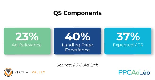
Figure 10. Pie Chart Showing the Distribution of Weights of the Three QS Components
This means that:
If you really want to get higher Quality Scores for your keywords, you should prioritize actions in the following order:
|
Getting past Null
By now we know that getting a QS matters, and that getting a good score matters more. But we’ve got to start somewhere and that’s by getting past null.
So how do we do it?
Let’s start with what Google Ads support says.
“Null quality scores appear when there aren’t enough impressions or clicks to accurately determine a keyword’s Quality Score”.
Now, something to note here is that impressions relate to exact match impressions (not our view – Google Ads support).
A Null score is null across all three of the QS components – ECTR, AR and LPE. Your score is either null for all or scored for all. There isn’t a partial score, so you can take comfort that when you get a score, you’ll get it throughout all the elements and you can start any triage efforts needed to improve.
Impact of match type
With that information then, you would expect that exact match keywords would be more likely to have a QS than a broad match. After all, the (almost) only impression that an Exact Match keyword should receive is, well, exact(ish) – we know exact is not exactly, exact.
So let’s take a look:
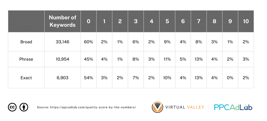
Table 1. Breakdown of Keywords (%) With Null QS by Match Type
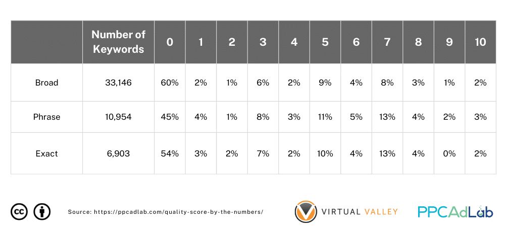
Surprisingly, the match type doesn’t behave in the way you might expect – at a surface level at least.
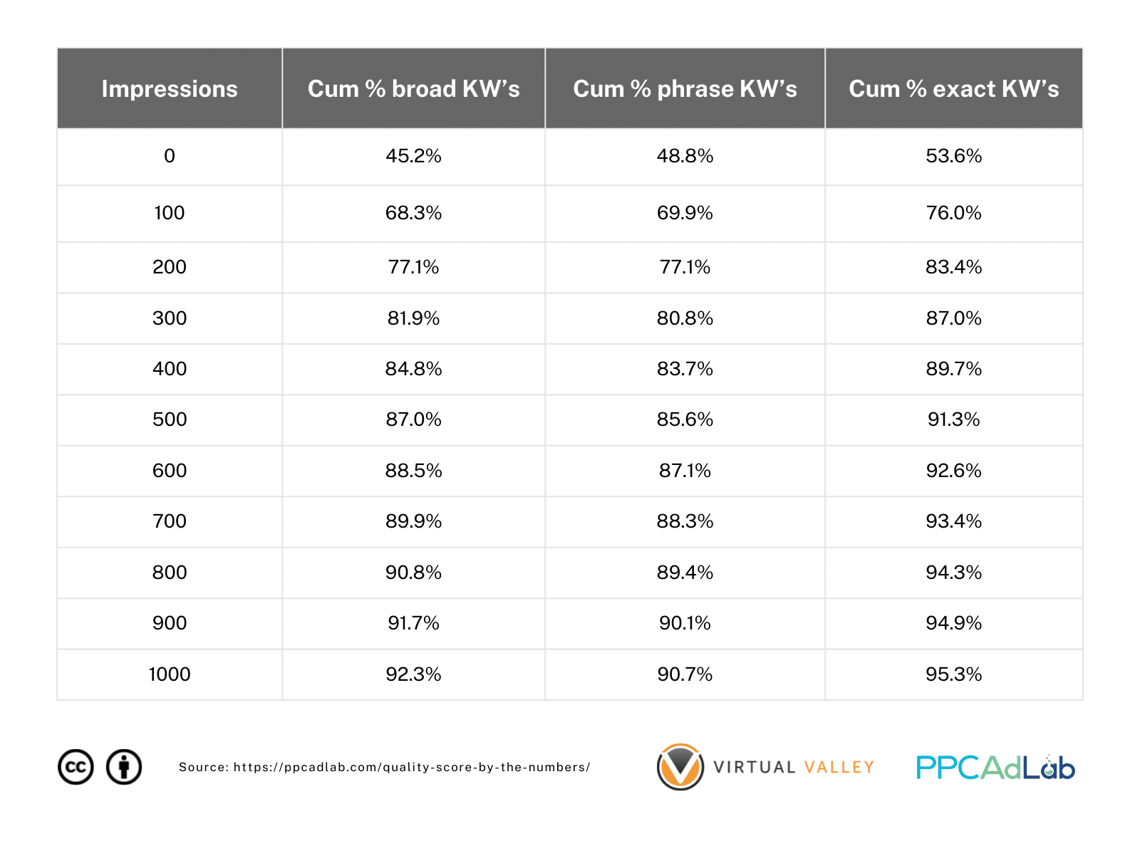
But what if we go a little deeper and look at the number of impressions each keyword has received. Table 2 can give us a clear idea.
Table 2. Breakdown of Keyword Match Types (Cumulative %) by Impressions
Now looking further at this let’s look at a 30-day period for keywords with a null QS.
Table 3. Breakdown of Keyword Match Types (Cumulative %) by Impressions
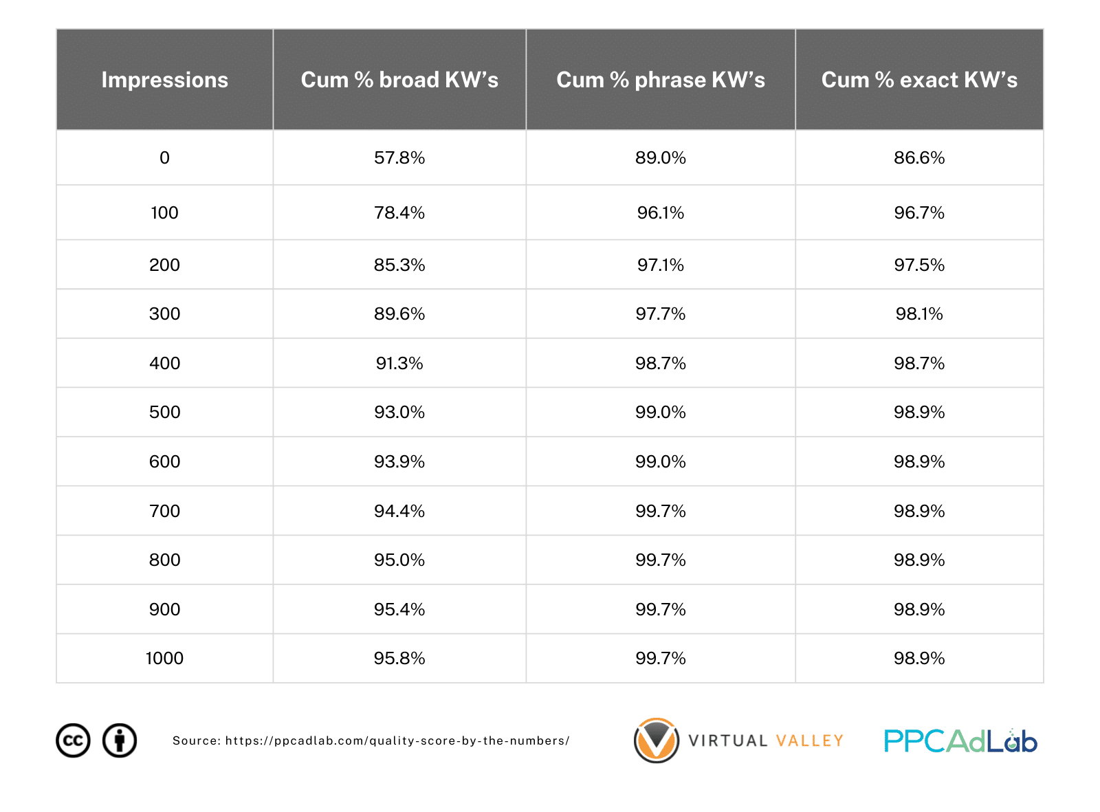 Note: Only keywords with QS > 0 Included
| Essentially, if you get 300 impressions in phrase or broad match terms within a 30-day period or 2,000 for Broad Match – you have a 98% likelihood of having a QS. It’s not quite a guarantee, but it’s pretty close. |
Looking at impressions in more detail
However, when we ran some analyses, we found out that ads do not have to have hundreds of impressions to get a positive QS. In most cases, we saw ads with only 1 exact match impression obtain a QS = 1.
See figures below.
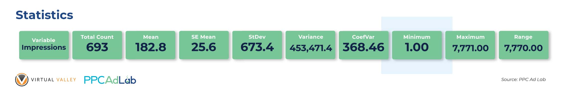
Figure 11. Summary Statistics for the Number of Exact Match Impressions Needed to Get a QS = 1
It is also obvious that there exists a huge disparity in exact match impressions (from 1 to 7,771) that can get a positive QS. This implies that more impressions will not assure higher QS.
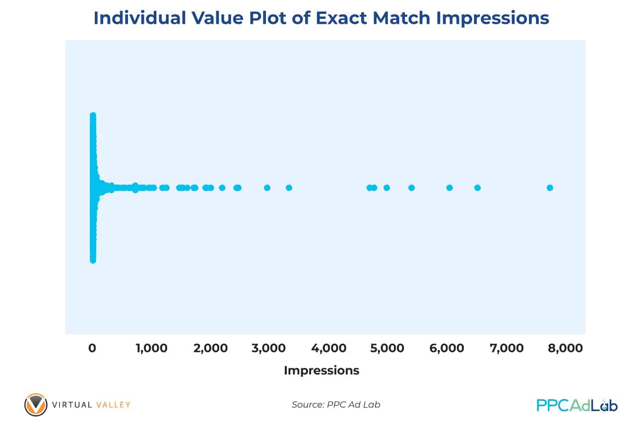
Figure 12. Individual Value Plots of Exact Match Impressions for Ads to Get a QS = 1
Our data also exhibits that the count of exact match impressions is not a good predictor of QS. The data that we gathered is widely distributed (standard deviation and variance are very large).
We can also generalize that having a null QS does not mean your ads will never show up on Google SERP’s. We’ve already proven that null from an impressions perspective is far better than a 1-4 QS.
Corollary to this, our finding contradicts Google’s claim that QS is based on the history of impressions for exact searches of your keyword.
Number of Clicks Needed
In order to get a QS = 1, is there really a minimum number of clicks needed? Based on our findings, the minimum number of clicks your ad needs to get a QS = 1 is only 2! The average number of clicks needed to get QS = 1 is 7.
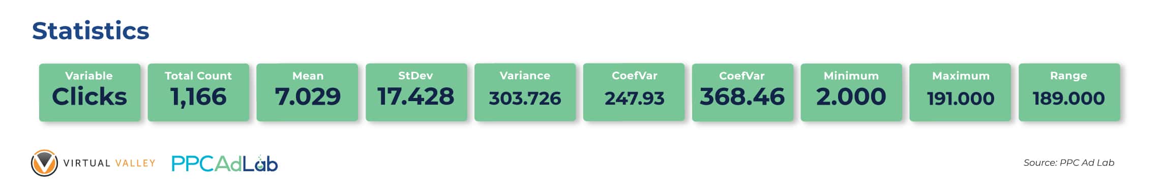
With a wide range (from 2 to 191), our finding suggests that ads can generate 2 to 191 clicks (Figure 13) and still get the same QS.
Standard deviation (17.428) and variance (303.726) obtained in our calculations show how dispersed the distribution of the number of clicks with QS = 1.
Figure 14 below shows the actual distribution of clicks and number of keywords (Frequency) with QS = 1.
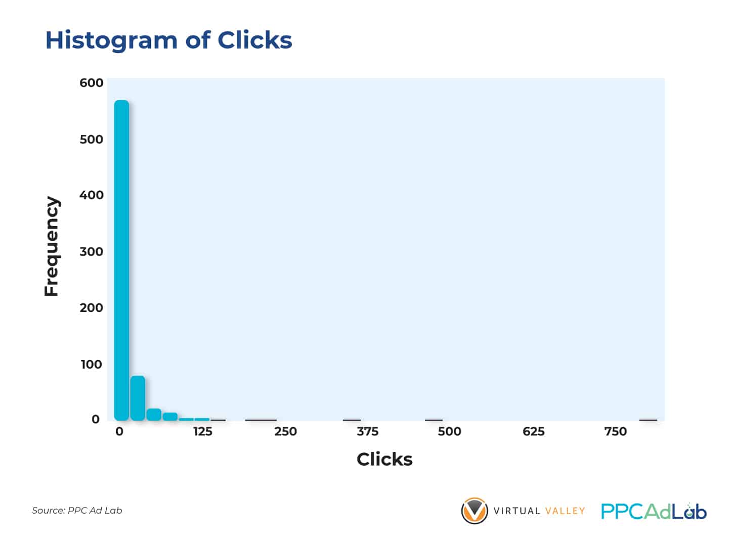
Figure 14. Histogram of Generic Clicks to Get a QS = 1
Impact of Exact Match Clicks on Getting a QS
Google support suggests that ads need to have enough Exact Match clicks to get a positive Quality Score. Our data shows that you don’t need a lot of Exact Match clicks to achieve this.
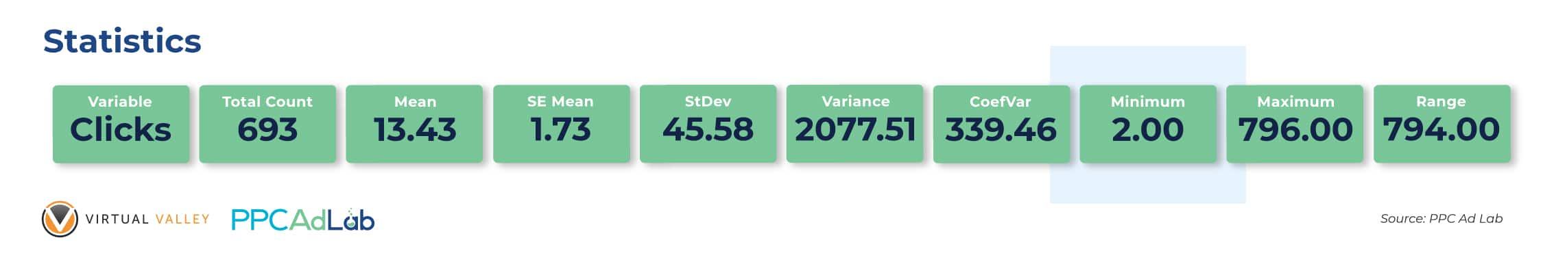
| Similar to our previous findings, your ads triggered by Exact Match keywords only need a minimum of 2 clicks to get a QS = 1. On average, 13 clicks can get an ad a positive QS. |
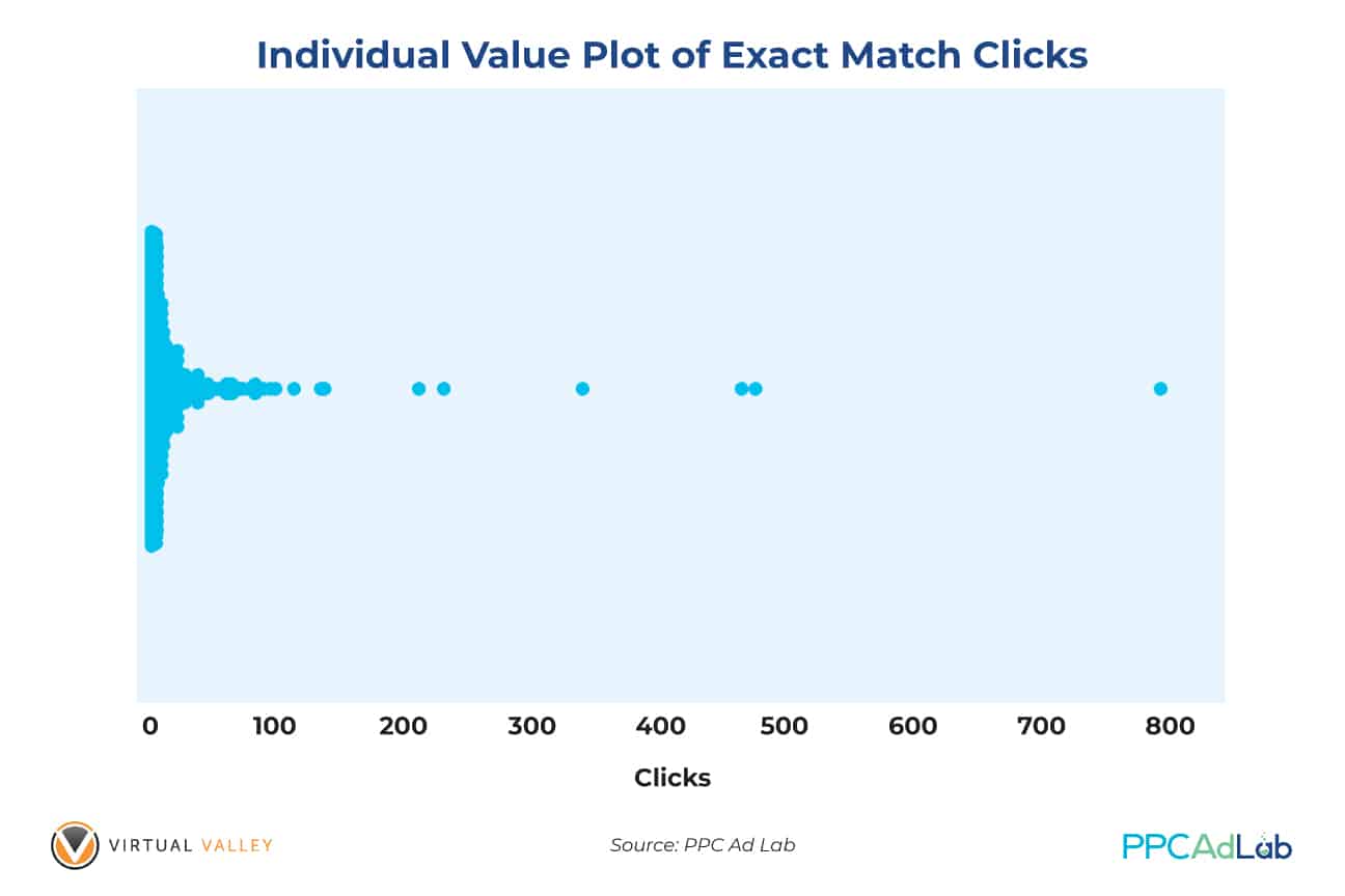
On the other hand, the result shown on Figure 16 is quite disturbing because of the wide dispersion of clicks – from 2 to 796. This range shows that your Exact Match clicks can reach almost 800 and only get QS = 1.
This further strengthens the fact that other variables have bigger impacts on Quality score.
In Summary
To get a non-null QS, set your campaign such that your keywords can get 300 impressions (phrase and exact match keywords), 1,000 for broad match as quickly as possible.
To achieve a non-null Quality Score:
- Bid sufficiently high for top of the page positions – you WILL be overpaying for these clicks but it’s the price of getting a QS.
- Ensure your targeting is sufficiently broad for your ads to show. Consider locations, hours, and audiences that are big enough to have sufficient search volume
- Budget – ensure you can afford to pay for clicks that are overpriced in the market sufficiently to get a QS.
Expected Click-Through Rate
What Google Says
Here’s the Google Definition:
A keyword status that measures how likely it is that your ads will get clicked when shown for that keyword, irrespective of your ad’s position, extensions, and other ad formats that may affect the prominence and visibility of your ads.
According to Google it’s a prediction of how likely your keyword is to be clicked based on past performance and your ad position. It is based on an assumption of an exact keyword match.
Expected Clickthrough rate like the other elements of QS has four possible scores:
- Null/Ungraded – no score awarded
- Below average – which Google suggests you might want to change your ad text so it’s more keyword related
- Average – which interestingly Google explains alongside the fourth score of Above average that there are no major problems with the expected clickthrough rate when compared to other keywords across Google Ads
- Above average
Note that:
- Expected CTR is a prediction. It is not the actual CTR. It’s adjusted for ad position, extensions and compared to other Google Ad accounts
- It is possible to have a high QS and low expected CTR (or vice-versa)
- Paused keywords retain their previous score.
Our test results
QS vs Expected CTR
Earlier in the report we showed our QS formula, and the strong relationship between ECTR and QS. We didn’t dive into it in detail earlier, so here’s the evidence that fed into our calculation.
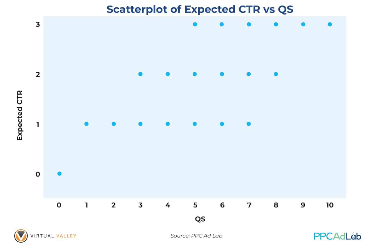
Note: Expected CTR’s are Recoded Scores: Ungraded = 0; Below Average = 1; Average = 2; Above Average = 3.

Our hypothesis testing at the .05 level of significance yields the following results: Quality Score is positively correlated (0.877) with Expected CTR which means that the higher the Expected CTR score, the higher is the QS. This further implies that Expected CTR is a good indicator of QS (p < .05). The relationship is very strong which further suggests that Expected CTR is a good predictor of QS.
Investigating what drives ECTR
Keyword match types
It seemed to us a logical idea that if you want your QS to be high for a keyword then making it highly targeted and relevant would be a good place to start, and so we looked at QS by match type. (Note in this table and throughout a 0 QS is no score – it’s just quicker to write).
Table 4. Distribution of Keyword Match Types for Each Quality Score
To summarise the data on Table 4, match type makes very little difference to the Quality Score.
Ok, so if it isn’t the match type itself, perhaps there could be something in the search term targeting. So for our next examination we looked at search term density – ie how many unique search terms triggered a click on a keyword to see if more tightly grouped keywords would yield better QS.
Our theory to test is that good control of search terms is likely to indicate a more robust negative keyword and match type strategy so “might” influence quality score.
This analysis is limited by the restrictions on search term data Google now reports so there may be something more that we can’t see here.
UST = Unique Search Terms
Table 5. Distribution of Unique Search Terms Count for Each Quality Score
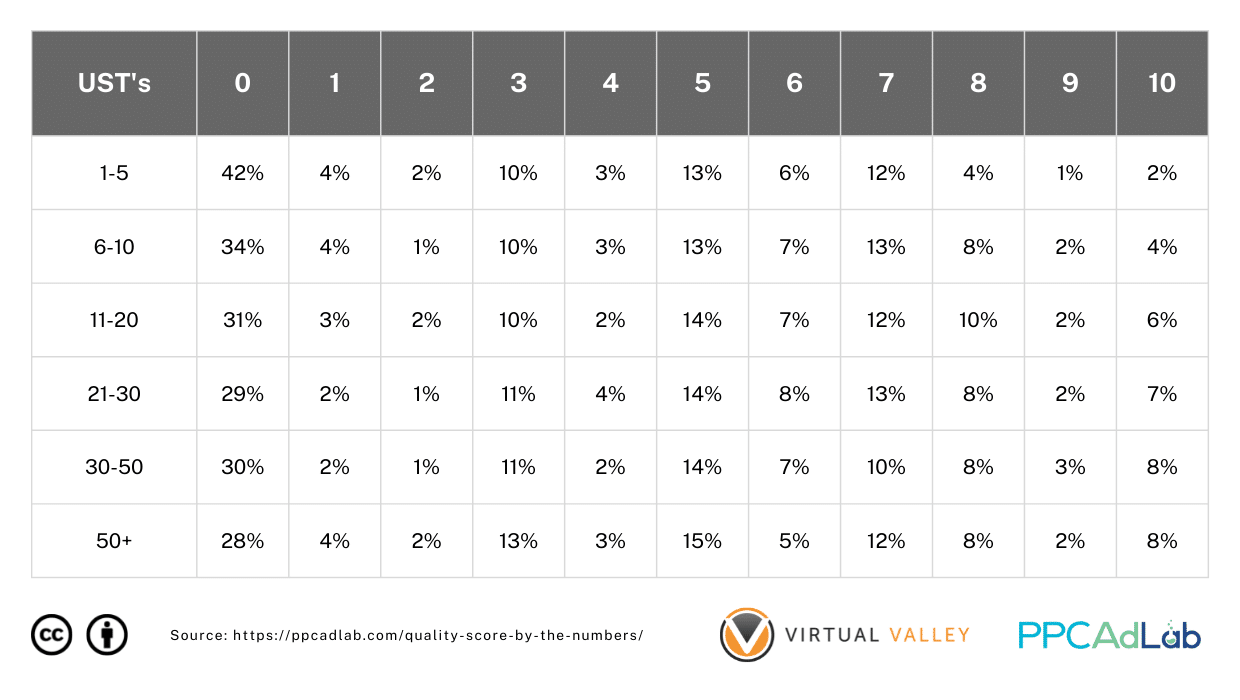
The results on Table 5 are SUPER interesting and shed a little light.
|
Most notably as far as search terms affect keyword QS:
|
As a final check on keywords, before we move on, let’s take a look at one other metric – the actual click through rate (CTR).
Table 6 below shows what we found.
Table 6. Distribution of CTR (%) For Each Quality Score
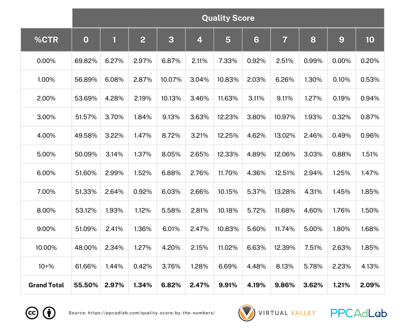
In this analysis, we looked at CTR rounded to the nearest whole percentage. So for example 0.49% rounds to 0.0%, 0.51% rounds to 1% and so on. It’s pretty hard to see anything meaningful from this table.
So, we dug deeper, and looked at the percentage of keywords in each percentage CTR and their respective Quality Scores.
What you might notice is that at low CTR percentages, quality score tends to be low, but as CTR increases, so does the prevalence of higher QS’s.
Looking at the delta’s between each CTR you can see the pattern emerge really clearly.
Table 7. Distribution of CTR Changes (%) For Each Quality Score
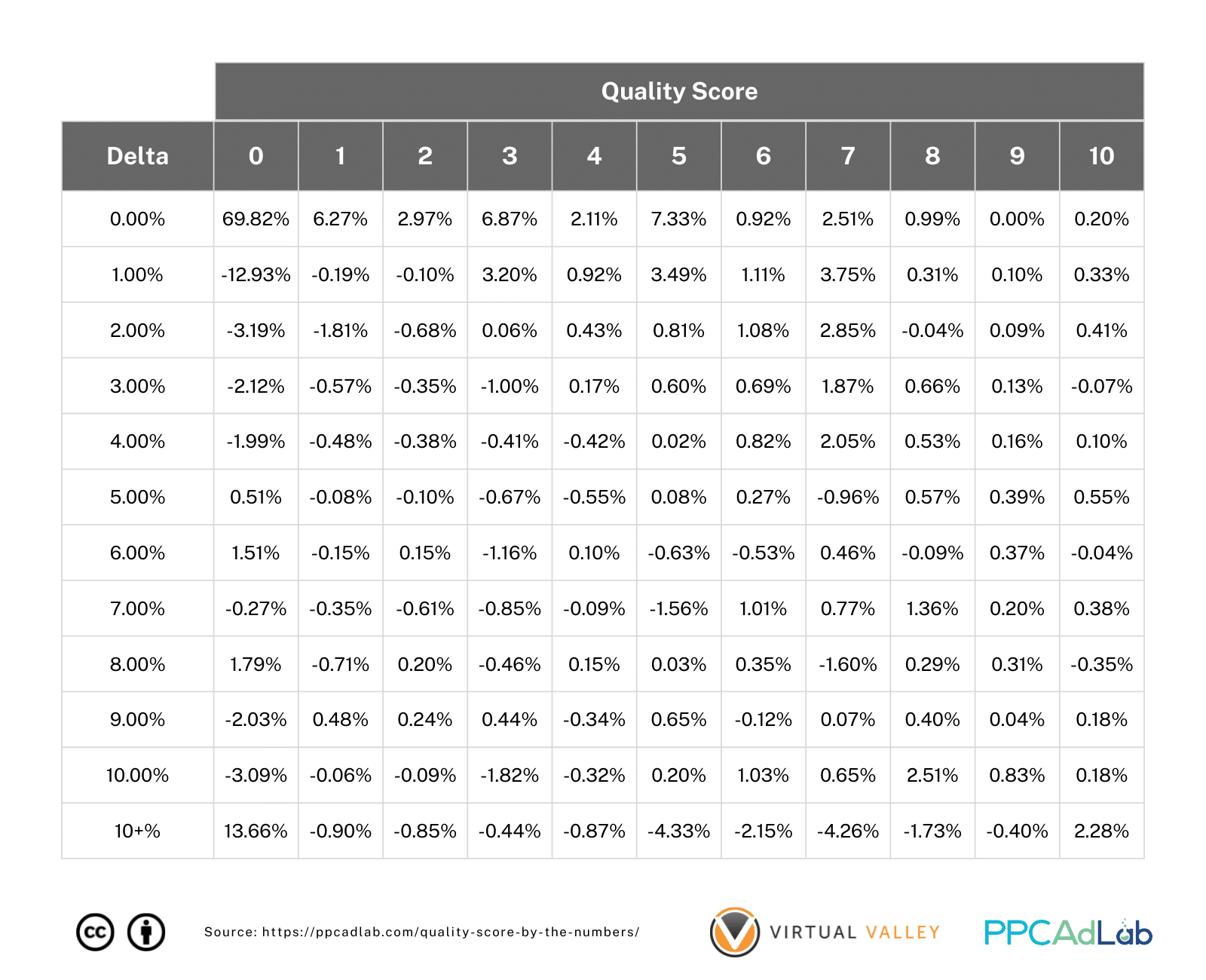
There’s a huge indicator here, you can see the pattern of red turning black in a diagonal across the page. Want a better QS – improve your CTR.
So, having a visual indicator that this might be true, we of course wanted to prove this finding with “proper math”.
So, we got to work and what we found out is truly amazing.

|
The Interesting Case of The SKAG
Without wanting to get into a whole other debate whether SKAGS, STAGS, or any other campaign structure is inherently better than any other, we do need to touch on the case of the SKAG as far as it impacts QS.
This is because, from our earlier test we’ve seen that matching multiple search queries with a keyword (6 or more as a minimum), you get a huge bump in QS.
So, if you build a SKAG structure, particularly using Exact Match types, how does QS hold up.
Here’s what we found, starting with looking at QS including nulls.
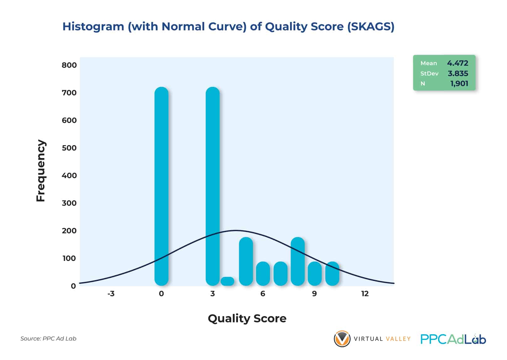
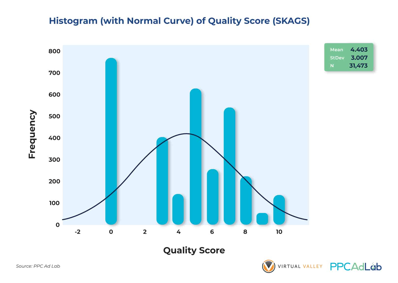
Figures 21 and 22 show the QS distributions of SKAGS and Non-Skags. With QS = 0 included, there is clearly no significant difference in the Quality Scores of both groups. The average QS’es are almost the same (4.472 vs 4.403) and Non-SKAGS have closer QS ratings (StDev = 3.007) compared to the SKAGS (StDev = 3.835).
While null QS is included in the population the results are well, exactly normal compared to any other structure.
So we examined them again, this time excluding the nulls, and something interesting happened.

After removing QS = 0 from our dataset to reduce skewness and non-normality of data distribution, we discovered that SKAGS actually perform better overall compared to Non-SKAGS.

While the math may be intimidating, essential, looking at Figures 23 and 24, SKAGS outperform Non-SKAGS significantly at the .05 level of significance. There is a statistical difference (p < .05) between the two groups’ Quality Scores.
| While this isn’t a report about account structure, it is very clear that this one specific account structure – the SKAG has a significant advantage over others when you only consider QS. Account management effort aside, there is a strong argument here for employing SKAGS, once you can push past the null QS state. |
Expected CTR and Actual CTR
One final point that we wanted to check before moving on from ECTR was a comparison between ECTR and actual CTR.
A hypothesis we wanted to check was that over time you would expect actual CTR and ECTR to tend together. After all, Google is pretty good with math so you’d expect their prediction model to be accurate.
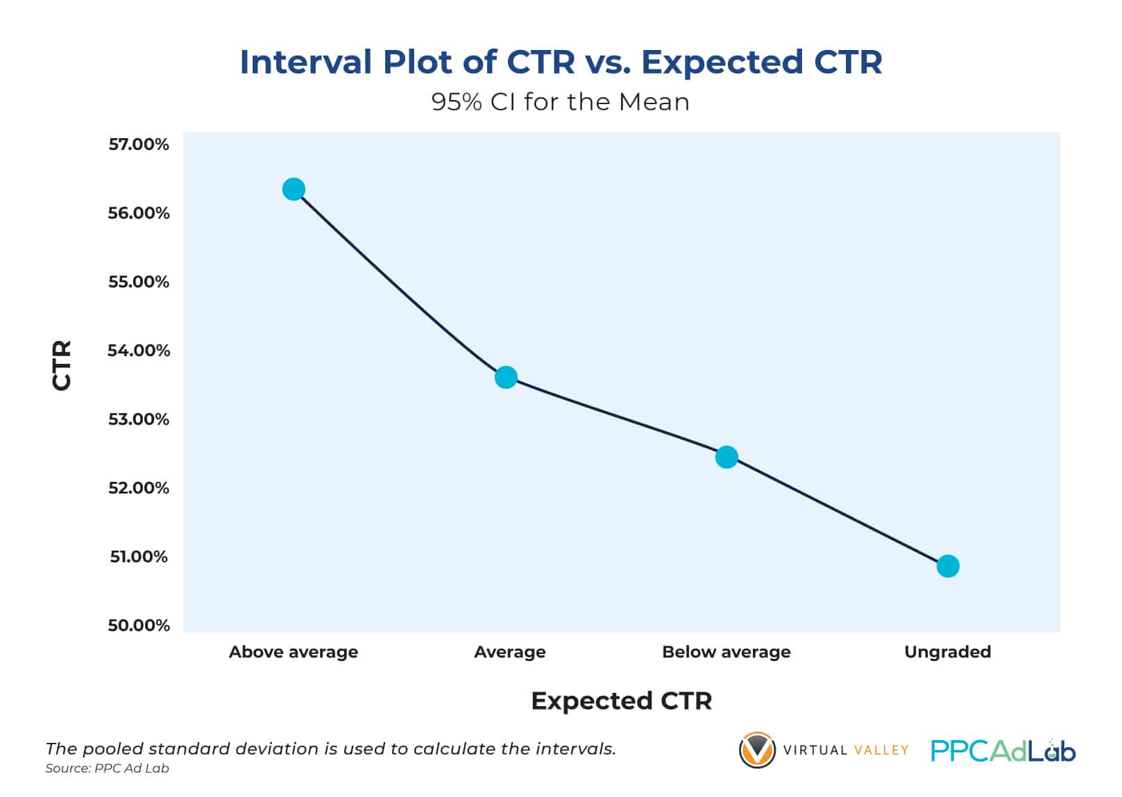
So, using our population dataset and cleaning our data for outliers, Figure 28 shows that keywords with “Above Average” Expected CTR ratings yield the highest actual CTR (between 56% and 57% on average). This is followed by “Average” with an actual CTR between 53% and 54%. “Below Average” got an average between 52% and 53%. The lowest category – “Ungraded” – got between 50% and 51%.
So, to keep ECTR high, then keep your actual CTR high. We’ll look at ads in detail in another report, but engaging, relevant ads seem to be the way to go here.
In Summary
To get a non-null QS, set your campaign such that your keywords can get 300 impressions (phrase and exact match keywords), 1,000 for broad match as quickly as possible.
|
To get a non-null QS, set your campaign such that your keywords can get 300 impressions (phrase and exact match keywords), 1,000 for broad match as quickly as possible.
|
Ad Relevance
Note – this is the least important part of QS and has the lowest impact (23% contribution). However, improvements can be some of the easiest so it’s simple to tackle.
What Google Says
According to Google:
“Ad relevance measures how closely related your keyword is to your ads.”
Again there are four possible scores:
- Null – no score awarded
- Below average – Google suggests that your ad or keyword may not be specific enough and your ad group may cover too many topics. Their solution is to reduce the size of the ad group.
- Average – which interestingly Google explains alongside the fourth score of Above average that there are no major problems with the ad relevance when compared to other keywords across Google Ads
- Above average
Note that:
- It is possible to have a high QS and low expected CTR (or vice-versa)
- Paused keywords retain their previous score.
Keyword Ad Copy Relationship
So let’s look at how closely ad copy and keywords are related and how that impacts your Ad Relevance score.
To do this we compared keywords (minus all the fancy Google notation such as [ ] to see if they were included and the impact that this had on the QS. We also adjusted to count DKI keywords as a match too.
Here’s what we found across 192,605 rows of data:
Table 8. Distribution of Ads With and Without Keywords in them by QS
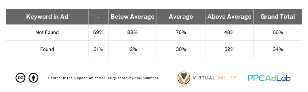
As you can see on the table above, there is a striking relationship between the keyword being in the Ad and the QS. About 52% of keywords where the keyword itself featured in the ad had an above average Ad Relevance, compared to only 12% where the Ad Relevance was below average.

From Figure 26 above, though, it’s interesting to see that only 23% of ads contain a keyword or a DKI equivalent. However, those ads with keywords in them exhibit higher average QS but a bit more dispersed in terms of distribution (With KW StDev = 3.35 vs Without KW StDev = 3.07).
We dug deeper and tested our hypothesis aimed at answering this question: Are the QS’es of keywords where the ad copy contains the keyword higher on average as opposed to those without keywords in them?
We found this:

Figure 27. Result of the T-Test Done in Determining the Difference Between the Mean Quality Scores of Ad Copies “With Keywords” and “Without” Keywords in Them
Our t-test analysis yields the following: keywords that trigger ads containing the keyword have statistically higher average QS than those without keywords in them (3.35 vs. 2.56). With a p-value of less than .05, this finding implies that using keywords in ad copy (Headlines, Descriptions, etc) will give your ads a higher likelihood of getting significantly higher Quality Scores.

Figure 28. Result of the T-Test Done in Determining the Difference Between the Mean Quality Scores of Ad Copies “With Keywords” and “Without” Keywords in Them (QS = 0 Excluded)
We found the same results (Figure 28) when we filtered our data and excluded QS = 0 from the dataset.
This finding includes DKI as a keyword match, so we can see that a DKI keyword is treated the same in ad copy as the keyword itself.
But what if only a part of your keywords trigger are in your ad copies? Will the QS be any different? Let’s see.

Figure X4 implies that partial keywords in ad copies influence Ad Relevance score (p < .05) at the .05 level of significance. This means that your ad copies do not need to contain your exact keywords. Even just a part of your keyword is enough to get you higher Ad Relevance scores as indicated by the positive correlation coefficient (0.414).
From a management perspective, we recommend that you create several variants of your ad copies by including partial keywords. This will also make the ads look more natural and engaging as opposed to using your full keywords in all parts of the ad copy (e.g., headlines, descriptions, and others). Statistics show that this could work as well as using full keywords in ad copies. So mix and match!
Impact of Ad Type
While looking at Ads we wanted to test if the type of ads contained in an ad group had any impact on the Ad Relevance. We have no evidence that it should, but nevertheless, thought it’s worth testing while in the moment (given Google has previously favored their latest feature – in this case responsive search ads).
Our sample for this test was from Ads run in the first quarter of 2021 as an up to date representative sample, and contained over 25,000 unique ads.
Table 9. Distribution of Ad Types Used Across 26,054 ads
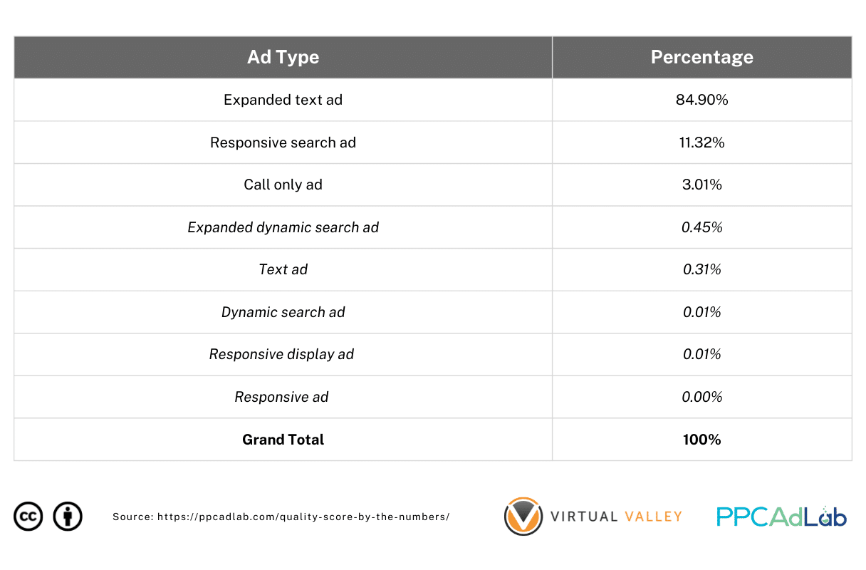 Table 9 shows the breakdown of ad types used across the sample.
The Expanded Text Ad Type is the most popular (84.90%) followed by Responsive Search Ads (11.32%) which is the new default ad type on Google Ads starting in February 2021. Call only ads account for only 3.01% of total ad types we have used. Less popular types are those table items in red.
Now we understand the sample, let’s look at what we found.
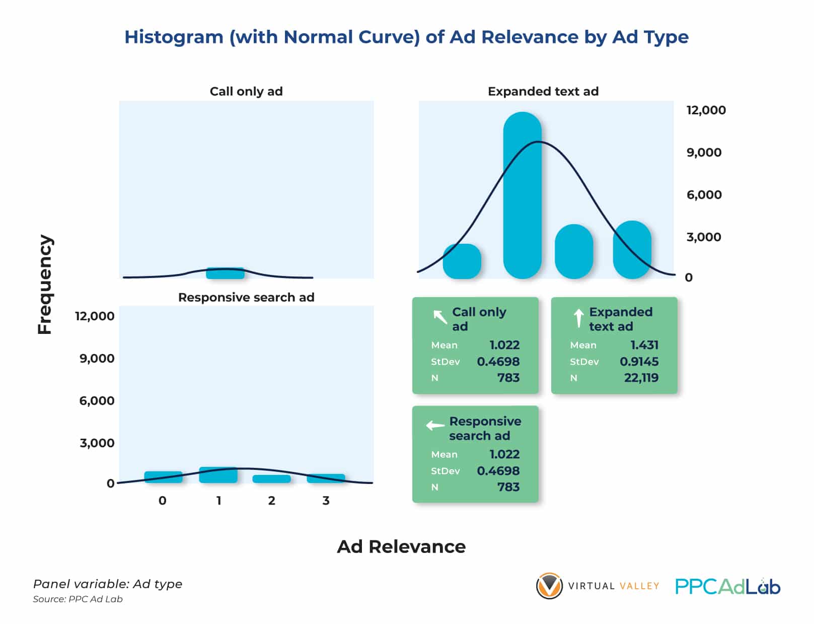
Figure 30. Side by Side Histograms and Summary Statistics of Responsive Search Ads, Expanded Text Ads and Call Only Ads
Figure 30 indicates that Responsive Search Ads (RSA) has the highest average (1.551) among the 3 ad types used in our test. The histogram of RSA also implies that their Ad relevance score distribution is better distributed signified by the StDev = 0.9818.
While this ad type has lower counts across many accounts (understandably so because it’s a newer ad type with more advertisers not opting for it in the past due to the idea of having more control), it looks like it is by far the best-performing ad type for many clients in terms of Ad Relevance.
To see if the means of the 3 ad types significantly differ, we performed an Analysis of Variance test to confirm or contradict our theory.

We found that there is indeed a significant difference in the average Ad Relevance Scores of the different ad types (p < .05) when we tested our hypothesis at the .05 level of significance (Figure 31).
We can therefore conclude that there is statistical evidence to prove that the Responsive Search Ad has a significantly higher average Ad Relevance score compared to other ad types. However this is only limited to the accounts that we manage and we cannot guarantee the same results for other agencies and clients not included in our sample dataset. We can recommend that you test your own dataset and see what ad types could work for your accounts or clients.
On the other hand, our finding suggests that choosing the right ad type for specific campaigns and ad groups (dependent on niche, target audience, among other things) could yield really good Ad Relevance scores, which in turn will contribute to higher quality scores.
In Summary
To get a non-null QS, set your campaign such that your keywords can get 300 impressions (phrase and exact match keywords), 1,000 for broad match as quickly as possible.
|
To Improve Ad Relevance Score:
|
Landing Page Experience
What Google Says
Here’s Google’s definition:
“A measure that Google Ads uses to estimate how relevant and useful your website’s landing page will be to people who click your ad. Landing pages with higher ratings are usually well organized and have text that relates to a person’s search terms.”
As always, there are four possible scores:
- Null – no score awarded
- Below average – Google suggests that you “consider” landing page changes
- Average – which interestingly Google explains alongside the fourth score of Above average that there are no major problems with the landing page when compared to other keywords across Google Ads
- Above average
Unlike Ad relevance and Expected CTR, Google has a further support article dedicated to “Understanding landing page experience”.
On the page Google instructs you to improve your landing page experience by:
- Offering relevant, useful and original content, in relation to your ad text and keyword.
- Promote transparency about your business including:
- Information about your business
- What you do
- Explain your product or service before asking for form fills
- Making contact information easy to find
- Explain why you are asking for personal data and how you will use it
- Make it easy to navigate
- Mobile first
- Make it quick and easy to find the information promised in the ad
- Don’t annoy users with popups
- Prioritize above the fold content
- Decrease load time
- Make your site fast – related to the tests on Google Page Speed insights
Overview
When evaluating Landing Page Experience scores, here’s how they are distributed overall on a typical account.
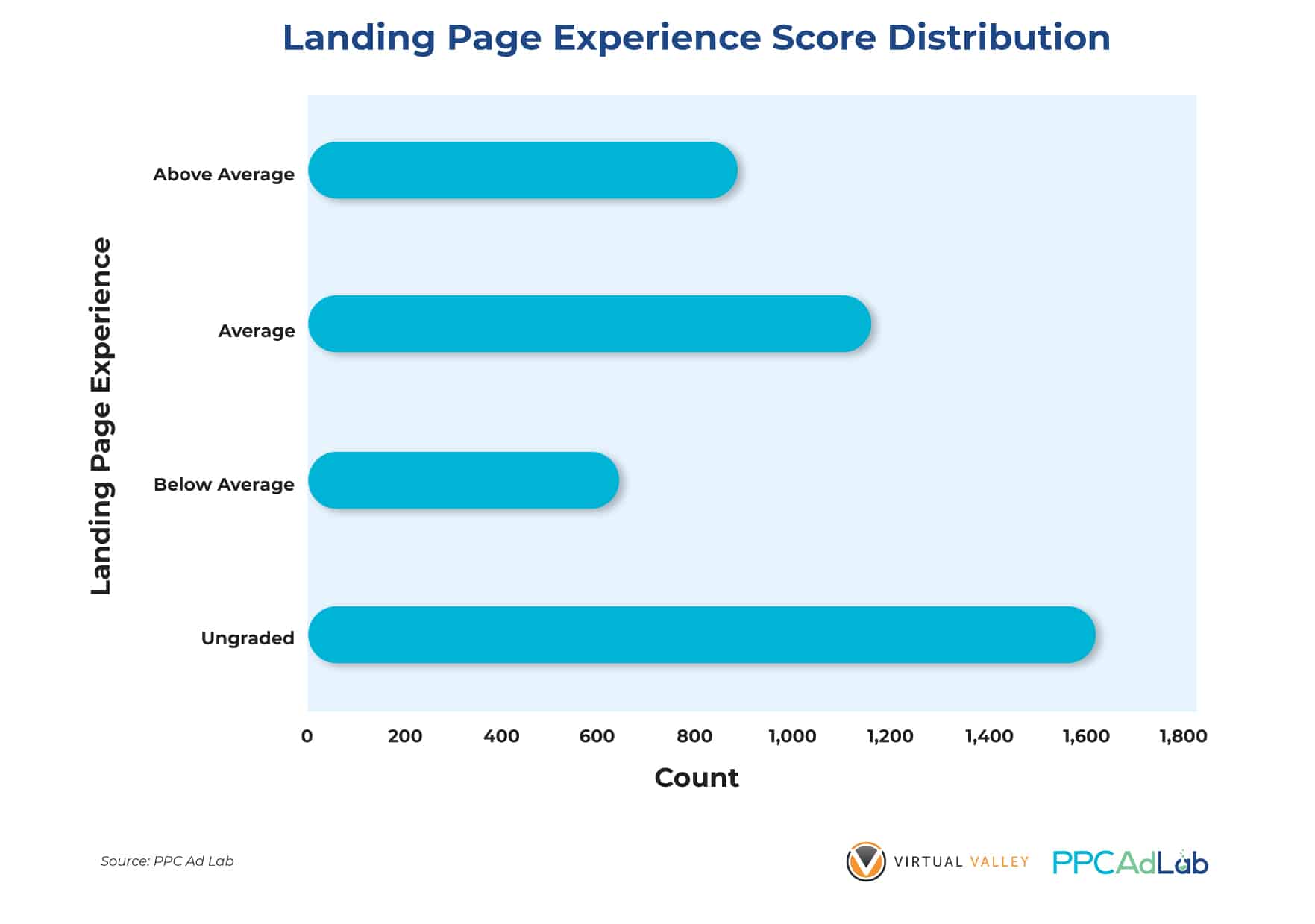
As with other QS components, the most common score is – No score/Ungraded. Once you get a score though only 17% (or much less) make the top grade.
Given that we already know that LPE is the most important element of QS (accounting for 40% of QS), we’re only tackling it last as it’s the order Google lists them in its support materials, then it’s important we understand it as fully as possible.
Our Testing
We’ve done a lot of testing on landing pages.
To be honest this was a bit of a treasure hunt. Run a test, stroke your chin thoughtfully, and run another, and another.
To review the tests and our findings – we’re going to look at them largely in the order we ran them.
Technology: Website vs Landing Page
Let’s start with websites versus landing page builder pages.
To run this test we used the following approach. If a page was using a non-http(s) or www subdomain, then we assumed it was built using a Landing Page builder tool such as Clickfunnels, Unbounce, Instapage or something similar.
e.g., https://www.bestplumberever.com = website
https://offers.bestplumberever.com = landing page builder.
It’s not easily possible to know how accurate that is. The only likely error is that some pages that are built using a landing page tool, that are shown inside a main web page using a plugin or similar will be identified as a website page, rather than tool built.
Comparing the two – here’s what we found:
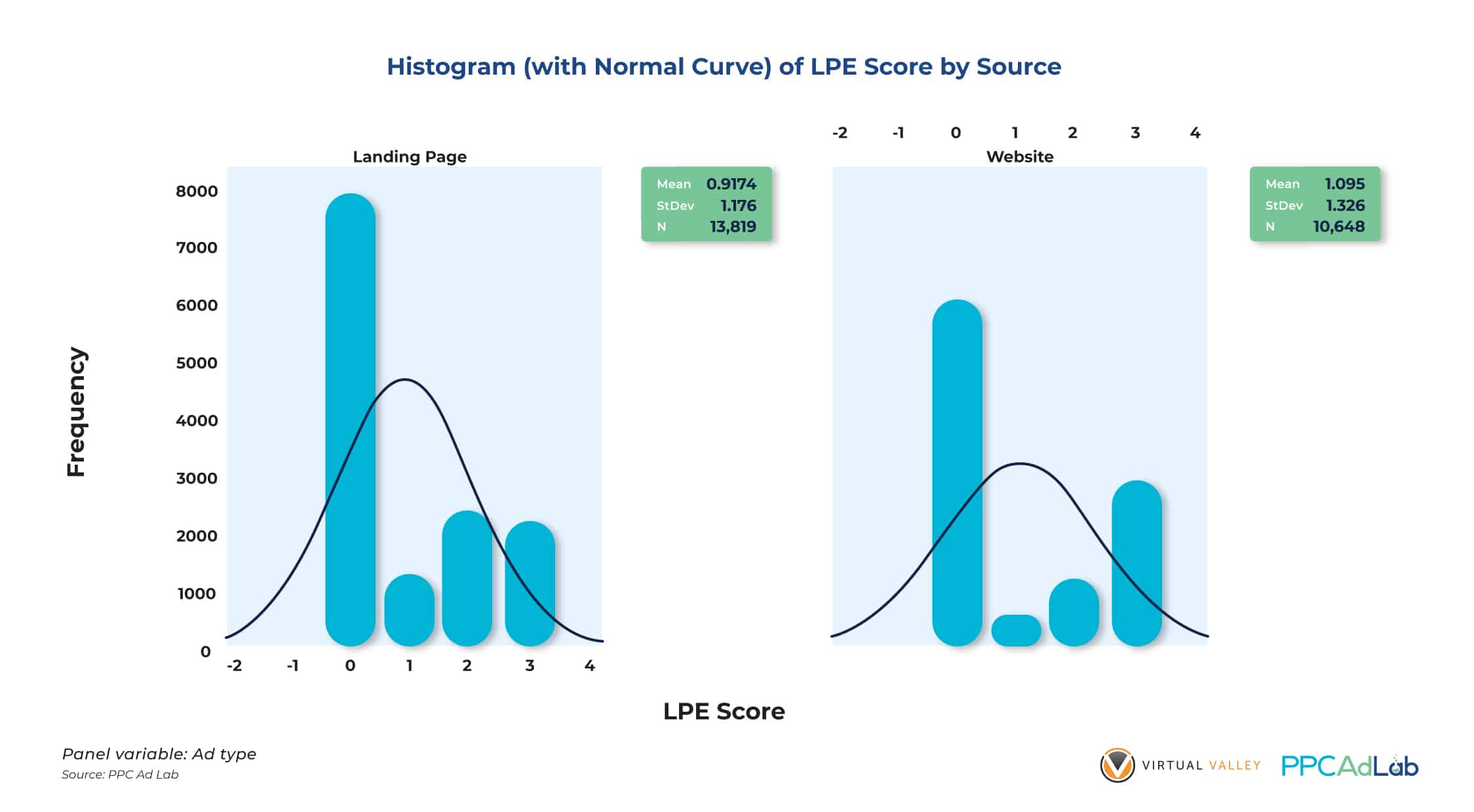
Figure 33 shows that website pages generally have higher average LPE scores than landing pages. It may not be much but if you’ll look at the distribution of the two page types, website pages have a better score distribution which means there is a higher probability of your ads to get higher LPE scores.
Why would website pages outscore landing pages built specifically for the purpose of running ads. It seemed odd. After all, these tools are often sold directly to people advertising on platforms such as Google to improve advertising ROI. They usually come with substantial subscriptions (our provider recently tried to increase our price from $6k per year, to $23k per year – thankfully we have our own technology now and don’t need them).
Page Structure
Having seen a surprising result in the technology battle, we needed to dive further, and understand why this might be the case. We started with page structure. The actual html elements that make up the page.
Full disclosure – this test was a huge PITA (pain in the ass).
We examined the page source of 991 landing pages, examining the html for keywords contained in:
- Page title
- Page description
- H1-5 tags
- Image alt-tags
- Image file names
In this test of 991 pages, we were trying to find the appearance of 91,000 unique keywords. Each test had to be run keyword, by keyword – it was a LONG test.
Here’s our complete findings:

Our test results at the .05 level of significance show clearly that adding keywords properly within your html source is significantly correlated (p < .05) with high LPE scores.
In particular the strongest link was seen in:
- Body Text
- Page title
- Meta description
- H1-3 tags
Now, when we dig into the difference between landing page tools and websites, it looks a lot clearer.
When building landing pages using page builders outside the main website, designers simply don’t use proper html tagging structures. As a result, they score worse when looking at html tags. Bringing page design and Google Ad campaign design closer together here would likely resolve this.
Page “performance”
Page Speed
Google support specifically calls out page load time as a factor in user experience. So let’s take a look at that first.
To do this we ran 990 pages through the Google page speed test (oh, how the hours flew by).
Here’s what we found.
[section to insert here]
Bounce rate
Having understood the page at a structural level, we wanted to understand the page from a user experience perspective. Our starting point, bounce rate. Our theory was that Google would relate a low bounce rate with a good LPE. Before we go any further let’s make sure we are clear in our definition of bounce rate:
Definition from Google Analytics:
A bounce is a single-page session on your website. It is triggered when your page loads and then there is no other request to Google Analytics.
Bounce rate is single-pages sessions divided by all sessions.
Why they use this metric is somewhat puzzling. After all, a landing page that the user visits to find an address or phone number can do Its’ job perfectly well without a click from the user.
Here’s where it gets really interesting. Take a look at the result below:

Bounce rate significantly correlated (p < .05) with LPE at the .05 level of significance. The negative correlation coefficient on Figure 35 (-0.064) indicates that ad landing pages with lower bounce rates get higher LPE ratings on Google.
Now if your page is slow and the user bails before they get there, you’re going to have a problem.
So putting the last two tests together, the conclusion can only be that you need fast pages that encourage a user interaction. So make your users stay longer on your landing pages!
More tests
So now we understand the impact of the page itself, we looked at the inter-relationship between the page and the ad groups and keywords that trigger the LP to show.
Let’s look at a sample table showing how often an LP can have differing LPE scores.

It’s quite clear that the page alone, however well constructed can receive different scores for different ad groups. After all, it’s perfectly logical that building a page that contains 50 different keywords inside it’s html, and is sufficiently relevant to have a low bounce rate across many keywords is really difficult. So, seeing multiple scores where pages are triggered by different ad groups is entirely logical.
Let’s examine – LPE score vs number of keywords that triggered the page

Data shown on Figures 37 and 38 all corroborate with our previous finding – the highest LPE Score (Above Average) row has the highest number of impressions using 2, 3 and 4 terms in keywords. This holds true for the breakdown of impressions for other LPE scores. Impressions start to go down from 5 terms upward.

Our results show that keywords containing more words have higher LPE Scores than those with fewer terms (p < .05). Our statistical test proves this direct correlation (0.013) at the .05 level of significance. This implies that more terms in a keyword are more targeted so expect lower impressions. Clicks could also be lower but for as long as your CTR is high, QS will not be negatively affected.
In Summary
Landing Page Experience is identified as the single most important element of QS, so one we need to understand fully and focus on optimizing.
|
For the best likelihood of an Above Average LPE score
|
Special Cases
There are some interesting special cases of QS in Google worth some attention of their own due to their real-life relevance.
Let’s look at:
- Near me – search queries. In theory, these should be hard to score well for.
- Brand campaigns – you might expect these to be QS 10’s all the way. After all, if you can’t score 10 for your own brand – then what can you score 10 for?
- Competitor campaigns – in theory, QS here should suck. But does it?
The Near Me Paradox
Why describe “near me” keywords as a paradox. Well, it’s because in theory at least they should be hard to score well in QS. Because:
- To write a relevant ad you would need to include the phrase “near me” – which is really difficult.
- Similarly, you would expect to need the keywords on the landing pages.
Overview
Below you can see an analysis of the “near me” search terms and the number of them that had associated “near me” ads in the ad group.
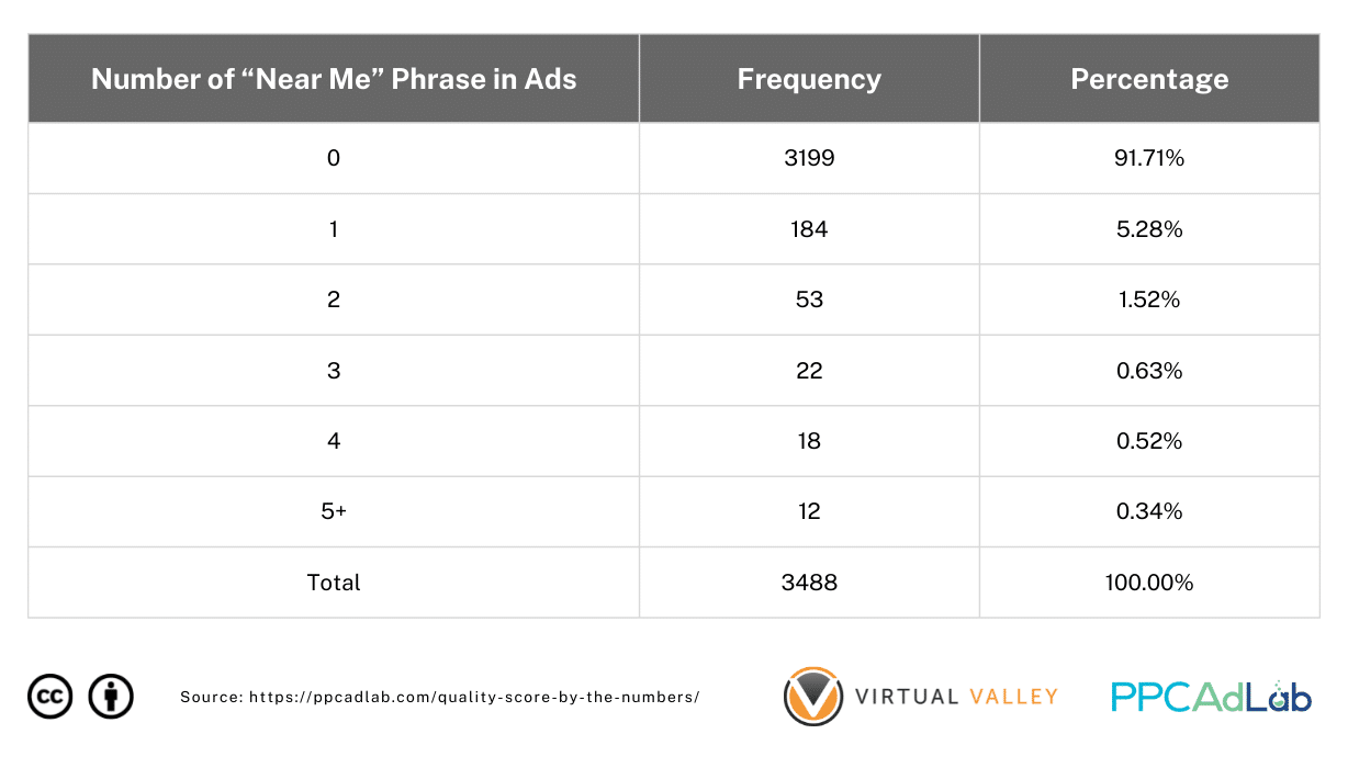
Table 10. Distribution of Number of “Near Me” Phrases in Ad Copies
Table 10 shows the use of the “near me” phrase in ads for “near me” keywords. Almost 92% of our ads do not contain the phrase and the rest (8%) typically, the phrase is used once in the ad. There are a few exceptions where about 3% of the total ads use the phrase more than once.
It’s not surprising that this is the case

On the other hand, our “near me” keywords are only 1.8% of our total keyword population. So we’re not talking about a big issue here but an important one for local businesses.
When we examine their QS, we get the following results.

Somewhat against our expectations, QS for “near me” keywords has a higher average QS than the “all keywords” population and this difference is statistically significant (p < .05) at the .05 level of significance!
This makes no sense as it does not fit what we’ve seen elsewhere in relation to ad relevance and yet here we are.
|
Essentially, “near me” is NO different to any other keyword or search term that better meets Google’s published support information. Why is that? Well to be honest we don’t exactly know. We haven’t specifically tested but it seems that Google interprets the “near me” phrase as a special case, and scores them more highly than it does other non-matched keywords. So don’t be afraid, start using your “near me”’s wherever appropriate. |
To Brand or Not To Brand – That Is The Question
You would expect branded keywords to kick ass when it comes to QS. After all, there are few words more likely to feature throughout your ad copy and landing page than your own brand, and no easier click to win than a branded one.
Now in testing for this, we have to be honest and admit to a potential weakness in our approach. As it’s very difficult to know in every account at scale, what is a brand and what isn’t, we simplified our approach to this test. We filtered campaigns into those that indicated “Branded” or “Non-Branded” in their campaign name, and assumed that the contents of the campaign were actually branded keywords. We know it’s imprecise but in absence of a more robust approach we felt it would suffice at least for this test.
Overview


In our data, keywords in branded campaigns only accounted for around 7% of all the keywords in our population.
Unsurprisingly – branded campaigns significantly outscore non-branded in terms of average QS. Figure 43 shows that the average QS for Branded Keywords is 4.88 while Non-Branded Keywords have lower average QS (4.04). That’s a 21% uplift, in case you think the difference is small.
On the other hand, for some people there is always the “I don’t want to bid on my own brand” argument. “I’m at the top of organic”. I get it, but let’s look at another important aspect – the account as a whole.
Here’s the difference in average keyword QS across the whole account, between accounts that are running a brand campaign and those that aren’t.
So, we know that having a branded campaign in your account creates a halo across your whole account. It isn’t just the branded search terms that see a higher QS. Everything else scores better.

To double the validity of our previous result, we did another round of test by excluding QS = 0 from our dataset and found the same outcome (Figure 44). This further proves that “branded” keywords indeed have significantly higher average QS than “non-branded” keywords.
Note though, the difference is even more dramatic. The average (non-null) QS for branded terms is 7.65 – 67% higher than for non-branded terms.
There is little QS argument for not bidding on branded keywords. There might be commercial reasons not to do so though.
|
Branded keywords have a substantial impact on QS across the account. Not only do they carry a QS 67% higher on average than non-branded keywords but the average QS across the whole account when it includes a branded campaign is 21% as a result of a halo effect. Based on what we have observed for CPC this difference could result in average CPC’s that are at least 8% cheaper across the whole account. |
Don’t pick them pick me
When it comes to bidding on competitor terms, other than trademarks there is nothing to stop you. And of course there are lots of views on both sides of the fence whether bidding on competitor terms is good or bad.
We’ll leave the commercial debate to one side, but let’s at least look at the QS implications of a competitor campaign.


Overview

If you want to bid on competitors, expect QS to be – well let’s just say “not nice”. Take a look at our real data:
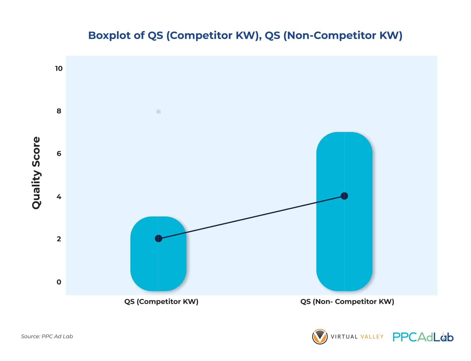
Now you might be able to run competitor campaigns profitably and power to you if you can. But just as brand campaigns give the whole account the benefit of a high QS halo, competitor campaigns carry a penalty across your whole account as evidenced by the lower average QS (2.05) against non-competitors’ average QS (4.10).
The range of QS ratings for keywords with competitor terms are short (from 0 to 3) while keywords with non-competitor terms are longer (0 to 7). This means that there’s a higher probability of getting higher QS ratings (4 and above) with non-competitor keywords.

This penalty has been proven by the significant difference between keywords with competitor terms and keywords without competitor terms. Based on our tests, non-competitor keywords perform significantly better (p < .05) than those with competitor terms at the .05 level of significance.
|
Competitor keywords have an average QS of 2.05, 50% of the average of non-competitor keywords in the same sample, and carry an average CPC premium of +$0.67. Worse though, there is a penalty “negative halo” that we have observed across accounts that contain competitor campaigns. Given what we already know in terms of the price benefit of improving QS, you can anticipate a premium on your average CPC of +12% across your entire account. That’s a big price to pay unless your account profitability depends on your competitor campaigns. You might want to consider two options:
|
Action Steps
Here’s our evidence driven guide on action steps for QS. These are based on:
All-Prioritizing impact areas
As we know that Landing page experience has the highest impact – start here. And within that we recommend the changes that we have identified as the biggest impact.
Then, move on to Expected CTR and repeat.
Finally, tackle ad relevance.
So: let’s wrap this up with some action steps:
Getting past null
Null is your enemy. It is the home of high click costs, and should be considered a transitory state that you need to get through as quickly as possible.
- Create a branded campaign
- Heavily negative competitors
- Make your ads super clickable, including your keyword (it’s easy – it’s your brand)
- Follow the steps below to get your landing page in good shape
- Then add proven, high-value converting keywords. Give them plenty of budget to get their required impressions (300 phrase, exact, 2,000 broad) as quickly as possible
- Gradually add more keywords
Landing page
- Get your keywords in the source of your page – titles, descriptions and h1-3 in particular. But remember – don’t spoil the human experience. You can’t bank Quality Score.
- Aim to engage the user so that they don’t bounce.
- Make the page load as fast as possible
- Create engagement devices so they click something that leads to an Analytics event.
Expected ClickThough Rate
- The key action here is to use copy to drive your CTR. Keep it engaging, valuable and make the call-to-action as strong as possible. Of course, make sure you deliver on the Landing Page.
- Keep your Ad Groups small enough such that each keyword in your ad group can trigger a highly relevant ad (and that the keyword can feed through to the landing page).
- Use strong negatives to avoid irrelevant searches
Ad relevance
- Get your keywords in your ad copy
- Test Responsive Search Ads
Special cases
- Make sure that you are running some of your spend on a branded campaign, your whole account will benefit with a reduction in average QS and therefore average CPC.
- Consider the whole account QS penalty carefully when considering competitor campaigns. Only start one if you are prepared to pay a 12% across your whole account.
- “Near me” is a special case, and you should consider it for local businesses.
And that’s almost it for this report …
What Don’t We Know
There are still things that we don’t know after all the testing and analyses we’ve done. We’ll revisit this report in due course and see where we think the biggest opportunities for further analysis exist.
In particular:
- Impact of previous account experience, i.e., possible QS of new keywords in old ad groups
- Impact on Ad Relevance scores of the following variables:
- Size of ad group
- Consistency of words in ad group (ie a few core words with variants)
- Ad formats (e.g., New Dynamic Ads)
Influences of the following variables on Landing Page Experience scores:
- Conversion rate
- Phone number on page
- Privacy policy
- Indexability of the ad landing page
- Differences in the % of ad spend on keywords with and without the “near me” phrase
- Differences in the % of ad spend on competitor vs non-competitor keywords
- Differences in the % of ad spend on branded vs non-branded keywords